What does it mean to have empathy in design? It just sounds like some kind of a buzzword, doesn’t it? To have empathy for your users, you need to look at the online version of your business (your website) from the vantage point of those navigating your website.
A Different Perspective
For first time users:
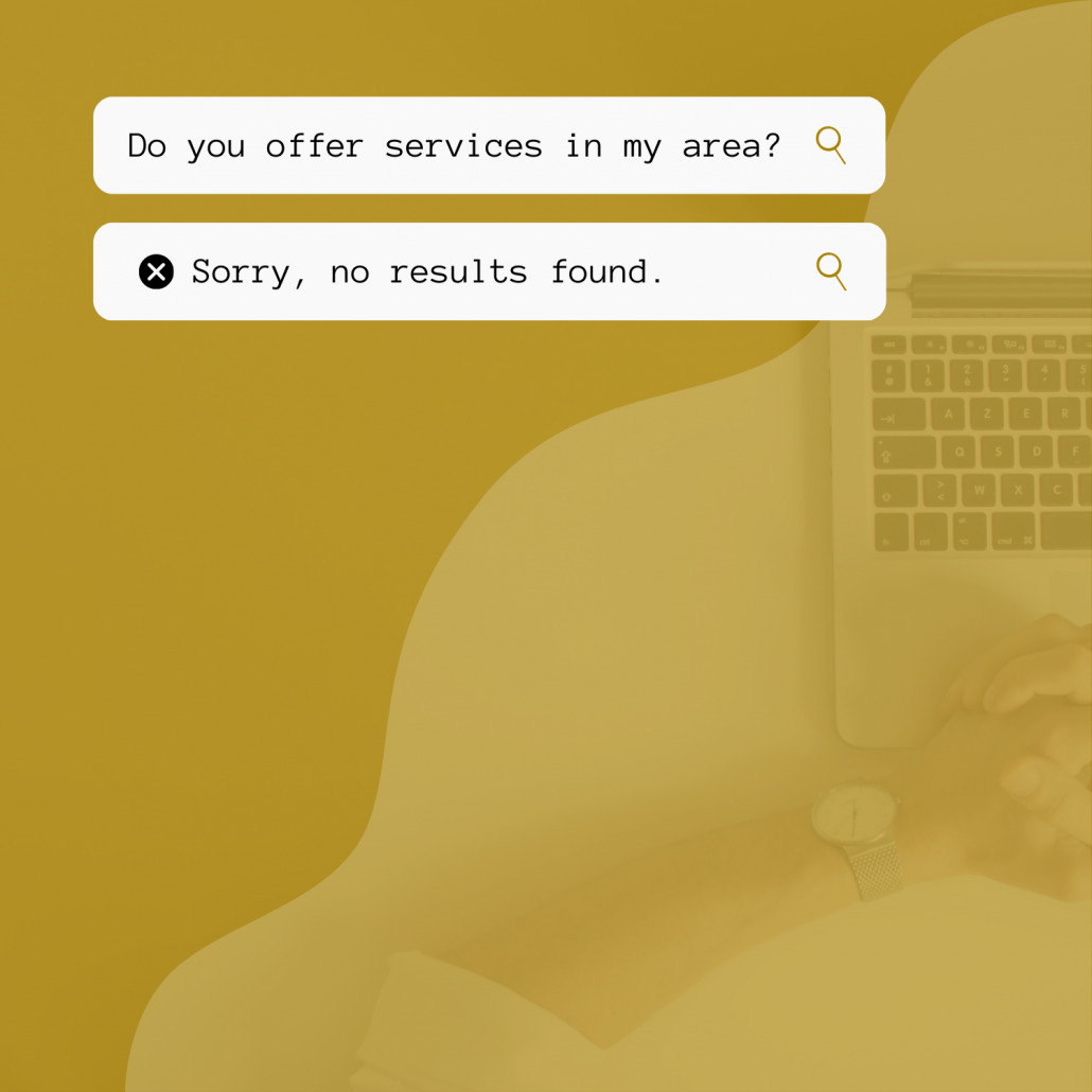
Who are they and what are they looking for? What questions did they put in the search bar to find you? What questions did they ask and not find answers for? What were they feeling when they saw the first content load on your site? Did you ace the first impression, or did you overwhelm them with information or frustrated them with the lack of it?

For returning users:
What caused them to return to the site? What pages did they head to when they came back? Did they have an easy time finding the information they needed or was it challenging?
Quick Tip:
SORTING OUT HOW USERS ARE FEELING IS NOT AS HARD AS IT MIGHT SOUND!
Do you have analytics installed on your website? An industry leader and huge metric machine, Google Analytics is a great resource to track the actions of visitors. If you have an account set up, look up your bounce rate and your New and Returning Customer data.
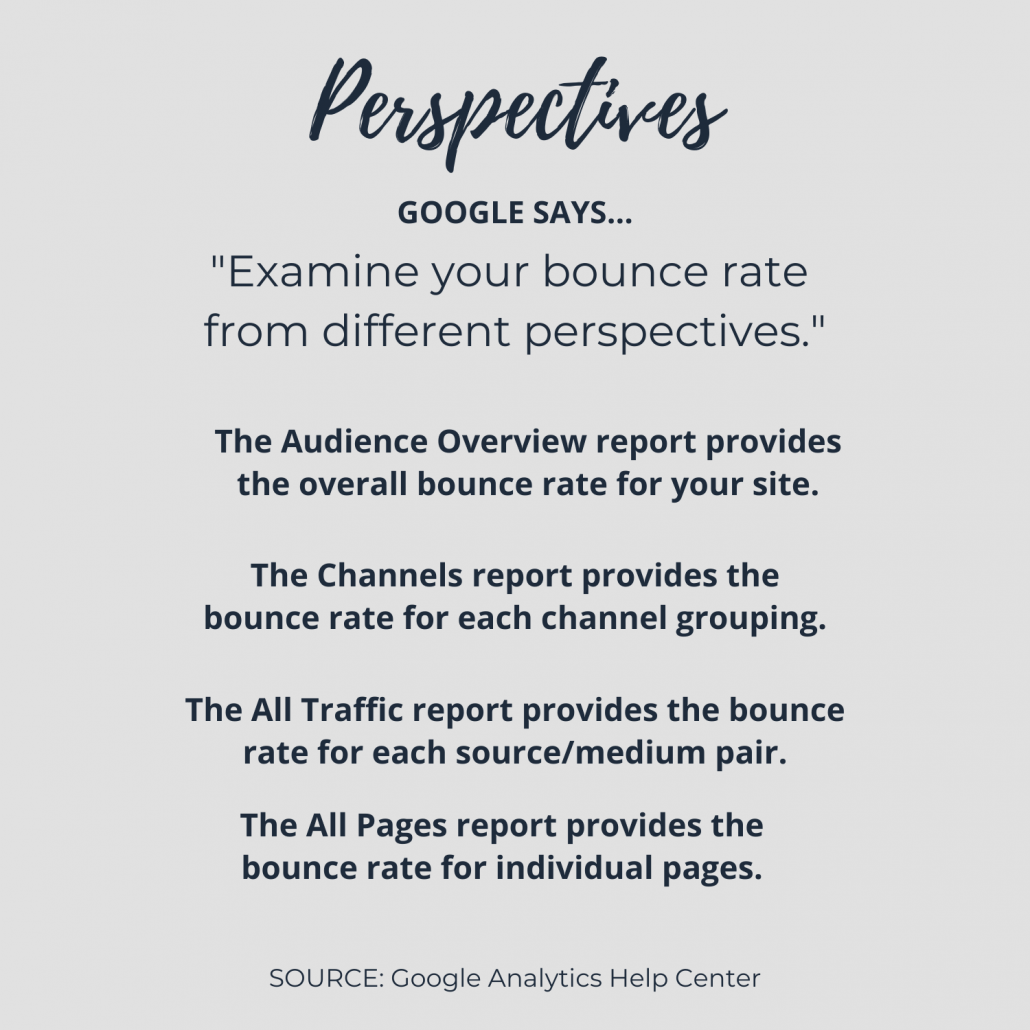
Have you thought about the places where your users might be confused? Maybe the issue isn’t with your entire website, but maybe the narrative on your homepage needs to be cleaned up and reconfigured to help both of these user types find what they are looking for more quickly. Or maybe it’s highlighting the main action you want users to take in the menu/navigation.
Project Highlight
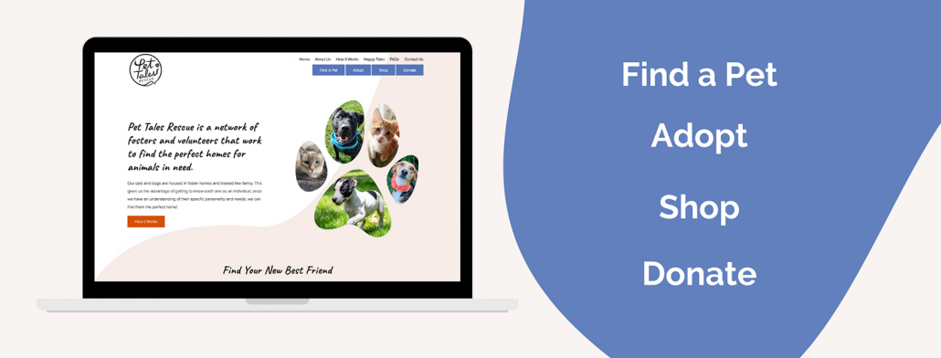
Pet Tales Rescue was looking to boost their online presence and connect with pet lovers in the digital sphere. CurlyHost designed and built a website that did just that, instantly boosting their online donations and adoption requests.
The website is also packed with functionality, allowing users to search for a pet right online, begin the adoption process from the comfort of their home, and support the shelter by shopping or donating with the click of a button. Pet Tales’ new website provides users with an up-to-date and thoughtful experience that easily converts to new connections for adoption and donations.
Consider Empathy in Design
Sometimes you don’t realize that there is a missing step or a step of chaos in your user’s journey until you go through each step yourself. The next time your website is slated to be updated, make sure to consider empathy in design and take on the project while considering the customer’s journey.
Best!


