You know that feeling when you walk into a room with intention, but suddenly that thought and intention dash out of your mind leaving you standing there utterly confused?
That my friend is the “Doorway Effect”.
This all came up because this week I was curious about monk fruit.
I started thinking about how I was doing the search. I was curious, sure, but I was also potentially interested in purchasing some baking sugar if it turned out that it was good for baking. It’s interesting that when I search “monk fruit what is it” I’m actually looking for is “will monk fruit work for baking”. What’s interesting about my search is thinking about how your users might find your site and being open to the fact that if you don’t have a blog post about that really random question your user had they’re never going to end up on your page.

Okay, okay… so what is the doorway effect?
Let’s break it down a little further.
Think of your mind as a three-story office building. (Stick with me for a minute!)

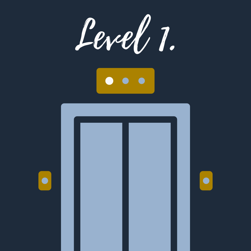
The first level is where you organize your individual thoughts. Thoughts are coming in and out FAST. And in the middle of the level is a receptionist that is answering phone calls, directing thoughts to where they need to go, ordering food and coffee for the “actions” to keep them moving. It is a busy place full of quick reactions and a few long term results because this level has no way of seeing the big picture.

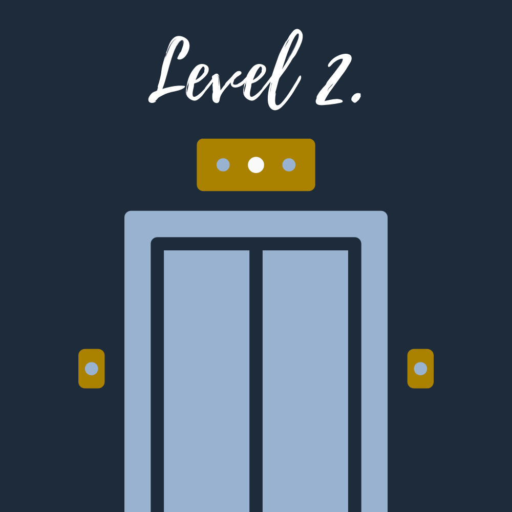
The second level is where your thoughts become actions. You weigh the importance of each of your thoughts, maybe even create a to-do list! So to speak, you work on reports, make copies, draw up graphics and statistics. This is your workhorse level – getting those everyday tasks completed.

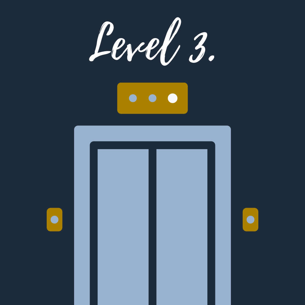
The third level is where you see the big picture of your life. This is the level you might not spend a lot of time in, maybe you visit it a few times a year for a big meeting to see how the “company” is running. When you get to the meeting – everything is spiffy! A well thought out presentation put together by Level 2. Donuts and coffee brought in from Level 1. Each item that the other levels worked on looks great, smells wonderful, and tastes even better – BUT Level 3 has NO idea how much work went into creating those end results. It is specifically focused on the big picture.
There is a disconnect between the levels! And the only thing that is bringing them together is the elevator. The elevator is your key, but don’t get me wrong, it is far from perfect. Sometimes you might click the wrong floor button, be SO bothered by the music selection, or even get stuck between floors – all resulting in a distraction from why you were on the elevator in the first place (a.k.a. the ‘Doorway Effect’ comes into play).
Now you might be thinking… how does this relate to websites?
When building out a website there are multiple levels; site navigation, design, layout, functionality… just to name a few. Each level is full of different size tasks, thoughts, and ideas. And for a website to have the best chance of successful results – you have to keep the big picture in mind on each level and MOST importantly, on the elevator. If the big picture is lost on the elevator some key factors might never come across on your website. Or even worse, cause the ‘Doorway Effect’ to happen to your site’s users leaving them confused, lost, and ultimately end with them leaving your website because they couldn’t find what they needed from you.

How to avoid the ‘Doorway Effect’ on your website?
Be concise. Focus on one or two subjects on a page. This will help site users find information fast and will also help with SEO.
Use simple navigation. Make sure that your site menu and page links are accurate, consistent, and easy to sort through. Providing simple navigation will help site users buy your products, contact you for your services, and have a positive website experience.
Provide a detailed blog. Write blog posts that cover subjects that people are thinking about relating to your product or service. Be intuitive to your user’s questions. Which will help them be interactive with your company and bring new site users in!
Update your website content. The functionality of websites change, and staying up to date with those changes can help keep your content fresh! Give a reason for people to visit your site so that they aren’t seeing the same images and blog posts over and over again.
But most importantly – find your voice, make it clear, and shout it from the rooftops! (…or on your social platforms)! It may seem repetitive, but keep going! Repeat your key message over and over and over again, so that you don’t forget and your customers don’t forget.
Questions to Consider
- How do you be intuitive to people trying to find you? How do you make sure you’re including the kinds of things that might allow someone to accidentally find you?
This is just something that takes you throwing a bunch of ideas out there but think about this with anybody in your field.
- Are they looking for an alternative to a more expensive version?
- Can you highlight how yours is comparable to a competitor’s version?
So, but this idea that the brain can only handle one idea at a time and your users, including Google, can only include one idea at a time, how might you organize your website differently?
- Would you separate each question out and explain it in more depth?
- What do you have a resource page with step-by-step tutorials for how something works?
- Do you have a glossary page explaining the idea behind some of the terms in this field that something might be researching to help them understand what you do better?
Make the assumption that people don’t know what it is you do.
Best!


